In my recent article Viewpoints I encouraged traders to look behind the numbers and headlines, to form their own opinions about the markets and their likely future direction.
One way I suggested that you could do that, was to look at market internals - The numbers and ratios behind headline index, sector, and individual stock price changes.
Why should you look at the internals?
Studying market internals can help traders to avoid outcome bias, which if you are not aware, is the tendency to judge an event by the end result rather than the journey to get to that point.
For example, imagine you just caught the last bus by the skin of your teeth, after a gig.
But to do that you ran across a traffic-filled 6-lane motorway.
Outcome bias can lead to anchoring, in which you take an incorrect assumption or belief and carry it forward into your future decision-making processes.
Effectively compounding your mistakes as you do so.
Trading is about so much more than being long or short of an instrument, which of course is what makes it so interesting to us and in particular to nerds like me.
Real-world examples
Let's look at some examples of market internals and see what they say about the current markets.
I am going to use data about US markets in this exercise simply because it's easy to access and there is generally more of it.
Our first chart plots the total advancing volume in the US stock market. Or if you prefer the total number of shares traded in stocks with rising prices.
Total advancing volume is drawn in black and that is overlayed by the S&P 500 index in red.
The chart is drawn over the last three months, and you can no doubt see that the equity index has been rising, despite a sharp drop in the total advancing volume - since a high point last month.
That is there has been less volume traded in stocks with rising share prices since a peak in mid-May.

Source:Barchart.com
Our next chart plots the percentage of US equities that are trading above their 50-day moving average.
An indicator that you can use to get a handle on momentum and trader sentiment.
Once again the indicators is drawn in black and the S&P 500 is in red.
This time the chart is drawn over a 1-year period.
Source:Barchart.com
I have added a downtrend line to the indicator to highlight the direction of travel.
As a guide in rising markets, we would expect to see the percentage of stocks trading above the 50-day moving average to be rising too.
However, this number has been trending lower since late December 2023, and despite a spike higher in May, we are back below the trend line once more, even as the S&P continues higher.
Third time lucky
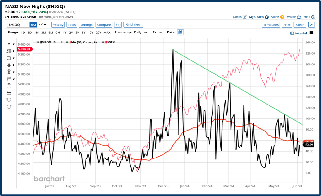
Our third chart looks at the number of new highs among Nasdaq stocks.
The reason to look at this metric is that technology and growth stocks have been pushing US equity indices higher.
And so we might expect to see stocks listed on the exchange, that specialises in tech and growth, to reflect that optimism/bullish sentiment.
The only trouble is that's not what the chart is telling us.
Once again the trendline, which I have added to the chart, shows the direction of travel.
And, as with the 50 D MA percentage indicator, shown above, this metric has been falling since late December. Even as the broad-based S&P500 index has continued to move higher.
Source:Barchart.com
Doesn't fit the narrative
Perhaps most surprising of all, (and certainly the biggest contrast to the narrative that growth and tech are driving a bull market) is the next chart.
Which plots the number of new highs posted by Nasdaq-listed stocks year to date.
This chart is also drawn over a 1-year period, with the indicator plotted in black and the S&P 500 in red. and in this instance a trendline in magenta.
We saw a massive spike in the number of new Year to date highs in early January, as we experienced a fresh wave of enthusiasm for all things AI-related.
However, after that initial splurge, the number of new highs fell away sharply and is now back in line with its pre-spike levels.
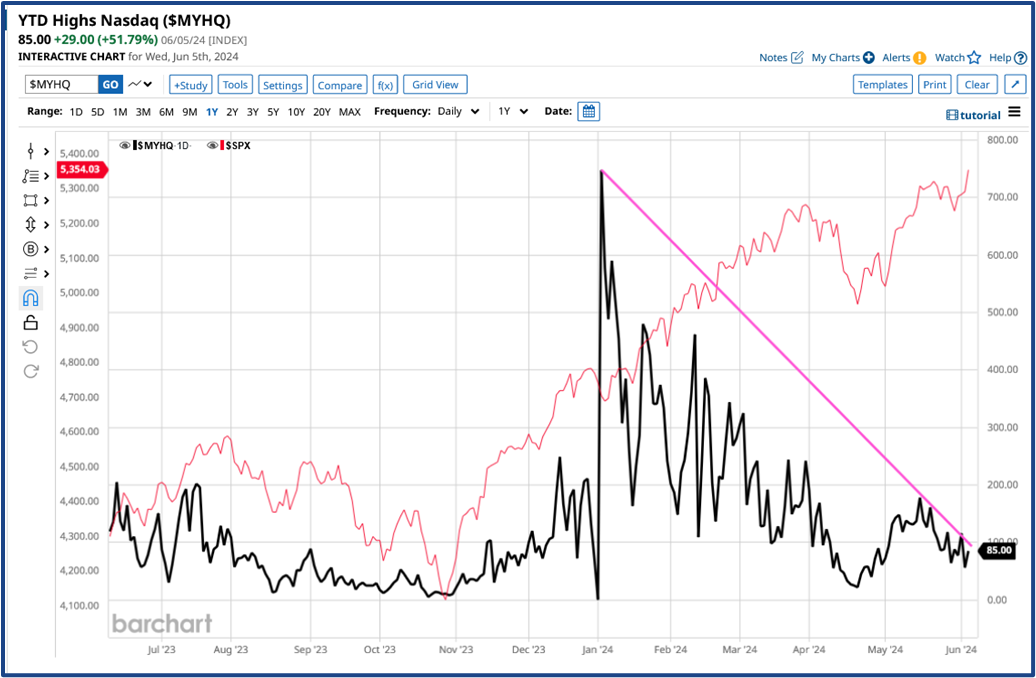
Source:Barchart.com
Perhaps the reason this struck such a chord with me is that an uptrend is often described as a “series of higher highs” and to have that you need to have stocks that are posting higher/new highs. and that's clearly not what we are seeing here
.
Conclusions
All of these charts lead us to one conclusion and that is that the performance of US indices is being driven by a very select group of stocks and one or two associated subsectors.
Those stocks are the Magnificent Seven.
Stocks with a direct link to AI, however more recently even this group of seven stocks have been thinned out and increasingly the gains are being driven by just one stock.
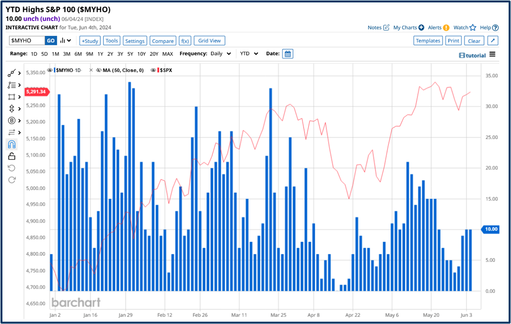
Source:Barchart.com
To some extent that's borne out by the chart above that shows the number of new, Year-to-date highs among S&P 100 stocks, the so-called mega-caps (blue columns) vs the performance of the S&P 500 index (red line).
Once again the overall trend in the number of new highs is downward, and that is not healthy or even helpful from where I am sitting.
Elephant in the room
The elephant in the room is of course Nvidia NVDA which has risen by almost +38.0% in the last month alone, taking its market cap to almost $3.0 trillion.
The stock will undergo a 10 for 1 split on June 10th.
No new shares will be issued, but post the split, holders will have ten times the stock, at one-tenth of the price.
Tesla TSLA underwent a stock split in August 2020.
It finished that month at $166.00 per share, and by the end of December that year it had traded as high as $264.00.
We may see Nvidia behave in a similar fashion, further fueling the trends we’ve observed in this article.
I want to leave you with a closing thought, and it’s this - The stock market is a pyramid, an incredibly stable structure with a broad-base to support the weight of the levels above.
However, that stability disappears immediately if you try to balance the pyramid on its sharp end.
The information provided does not constitute investment research. The material has not been prepared in accordance with the legal requirements designed to promote the independence of investment research and as such is to be considered to be a marketing communication.
All information has been prepared by ActivTrades (“AT”). The information does not contain a record of AT’s prices, or an offer of or solicitation for a transaction in any financial instrument. No representation or warranty is given as to the accuracy or completeness of this information.
Any material provided does not have regard to the specific investment objective and financial situation of any person who may receive it. Past performance is not a reliable indicator of future performance. AT provides an execution-only service. Consequently, any person acting on the information provided does so at their own risk.